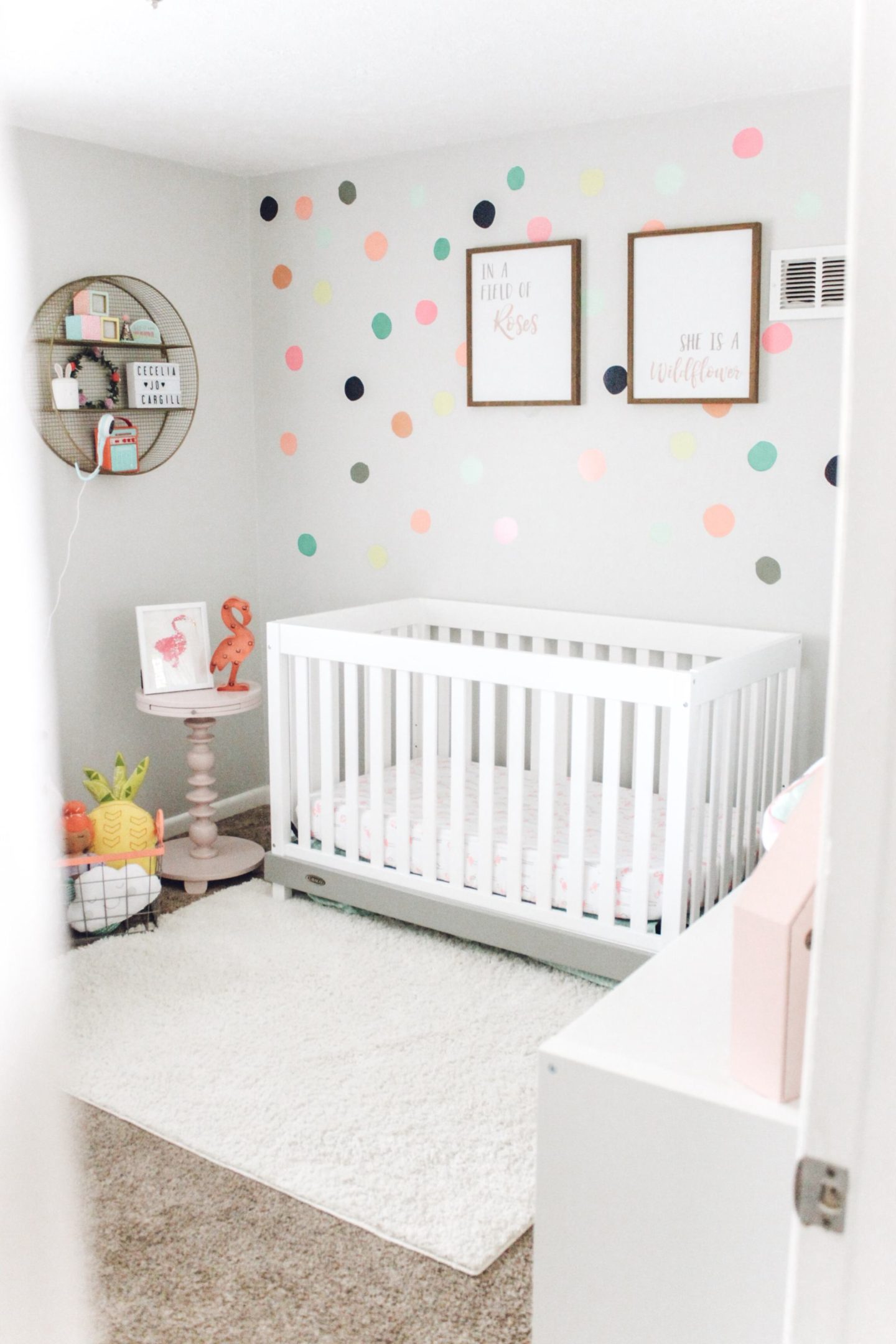
I am so excited to share Cece’s updated baby girl nursery. After designing Holly’s nursery I felt like Cece’s room really needed a face lift. Something always felt like it was missing from her room. I loved the overall bright theme and most of what was in the room, it just needed some rearranging. I was so excited to revamp her bright and colorful baby girl nursery.
Here’s what I changed:
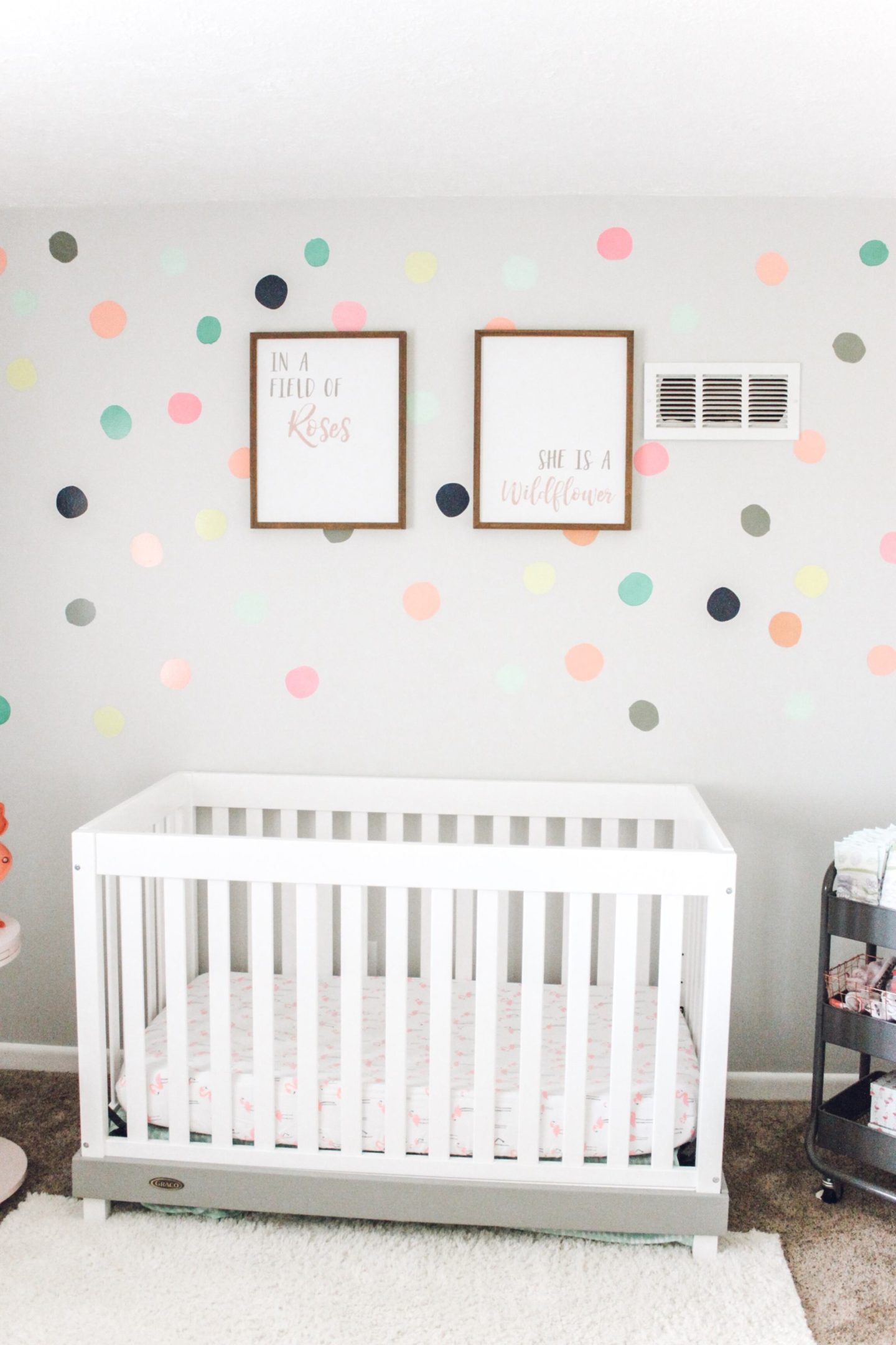
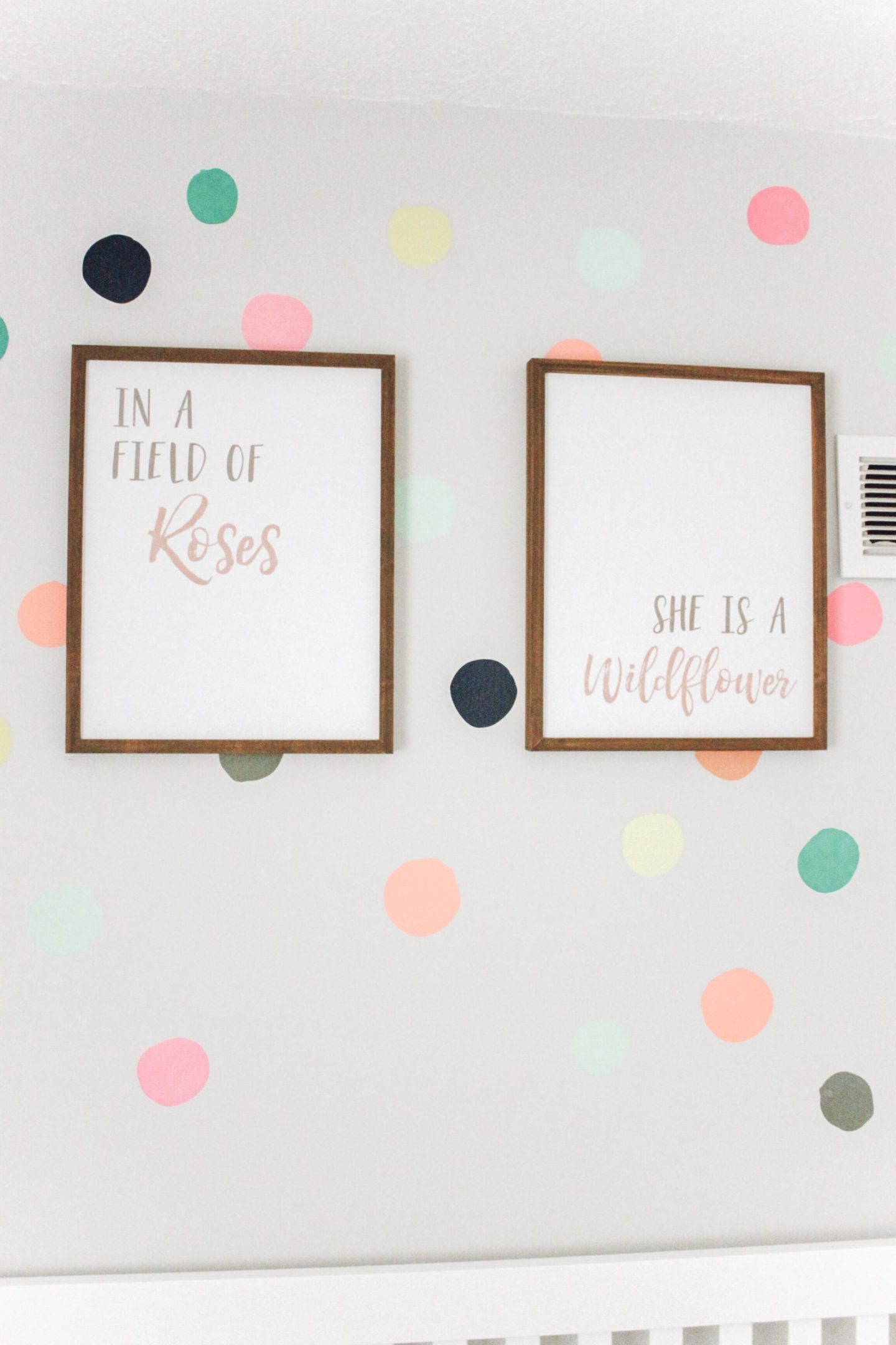
The main differences in her room are: I centered the crib on the back wall, took out the rocker, added the gold shelf, window treatments, wood art above the crib and wood toy chest. It’s amazing what a little rearranging can do for space. I had leftover polka dot stickers from when we first did her room so I was able to polka dot the whole wall. I love the bright colors and how they are not perfect circles. They almost look like Cece painted them on. Unfortunately, they are from the discontinued Oh Joy brand from Target. The bright colors in this room are so perfect for her bright, bold, and wild personality. The wood art above her crib is what really got the ball rolling on this project. The quote is just so her. She is our little wild child. I love the idea of a bright baby girl nursery and these few updates made her space feel complete.
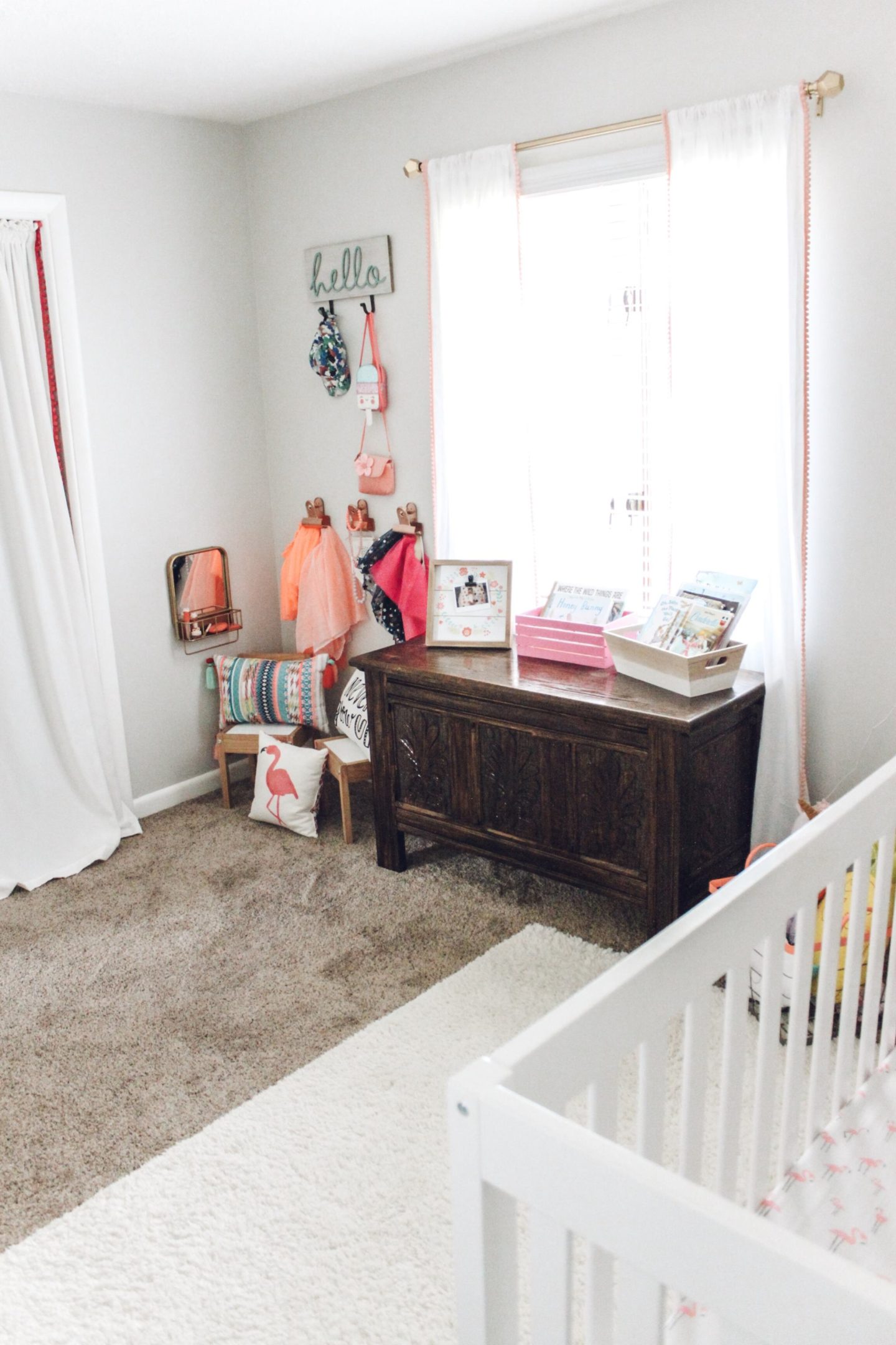
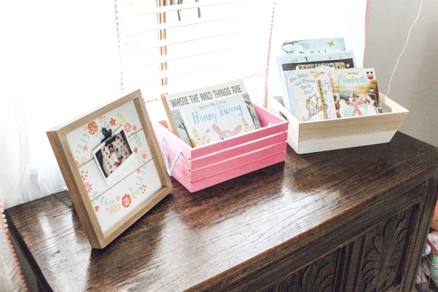
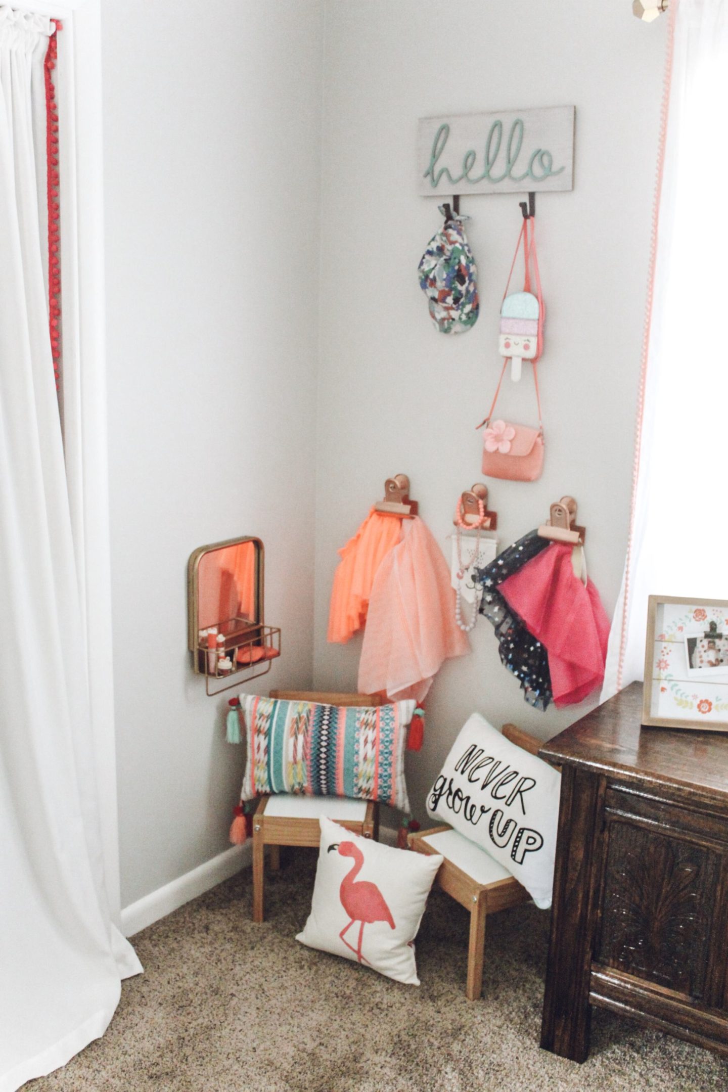
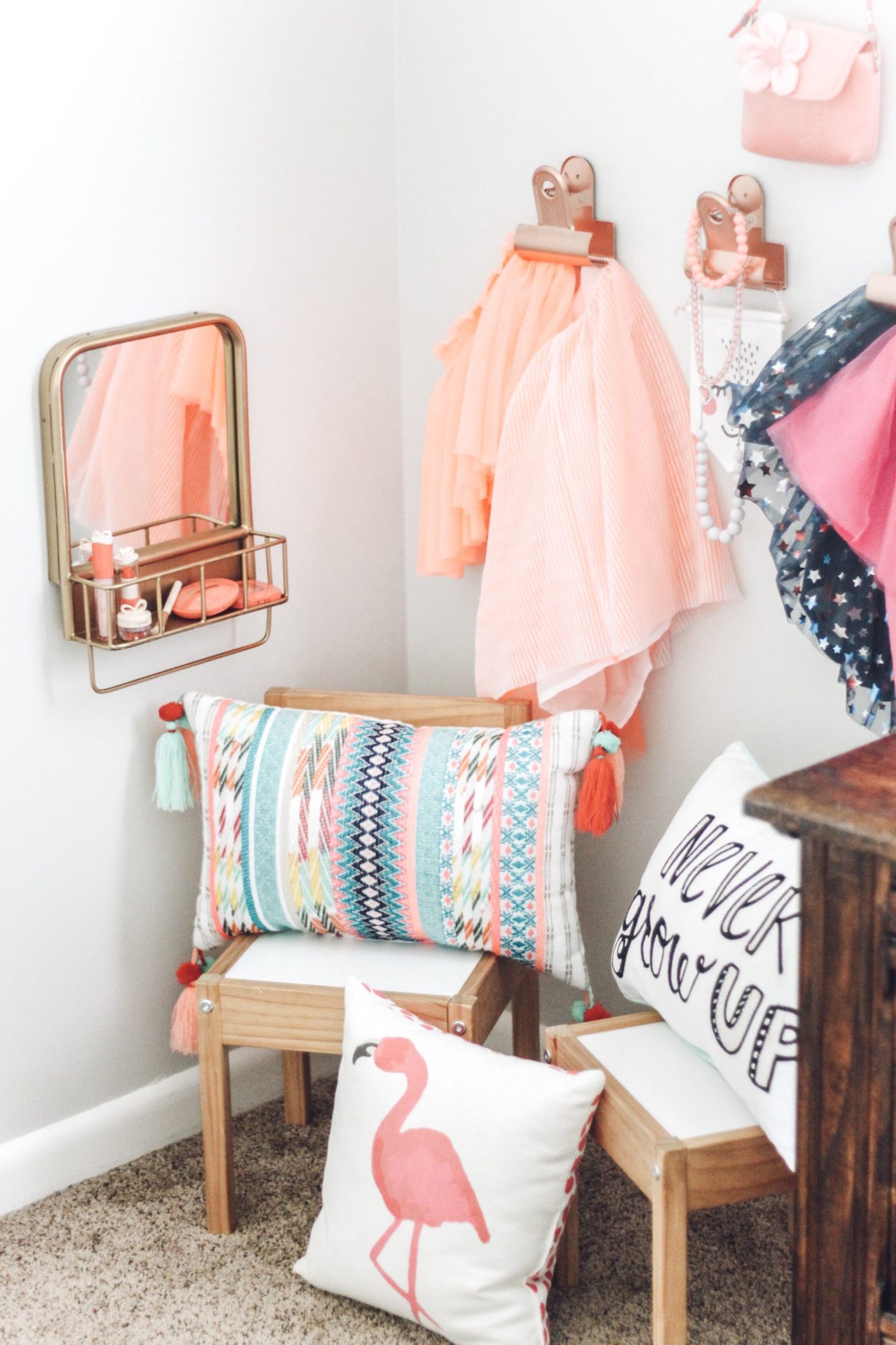
We brought in the wood toy chest from the playroom and moved the Ikea organizer where the changing table used to be. Since she won’t need a changing table much longer we just put the pad on this for now and it works perfectly. She has a little reading and dress-up corner with her chairs. She actually likes to go sit climb on them. We did similar window treatments that we have in Holly’s nursery. They just make space feel so much cozier. The three large clips are one of my favorite pieces in her room. They can hold clothing, accessories, or even artwork. Like, Holly’s nursery I love incorporating gold and rose gold into their spaces. The copper color is sold out but they are available in silver and black and could easily be spray painted to whatever color you need.
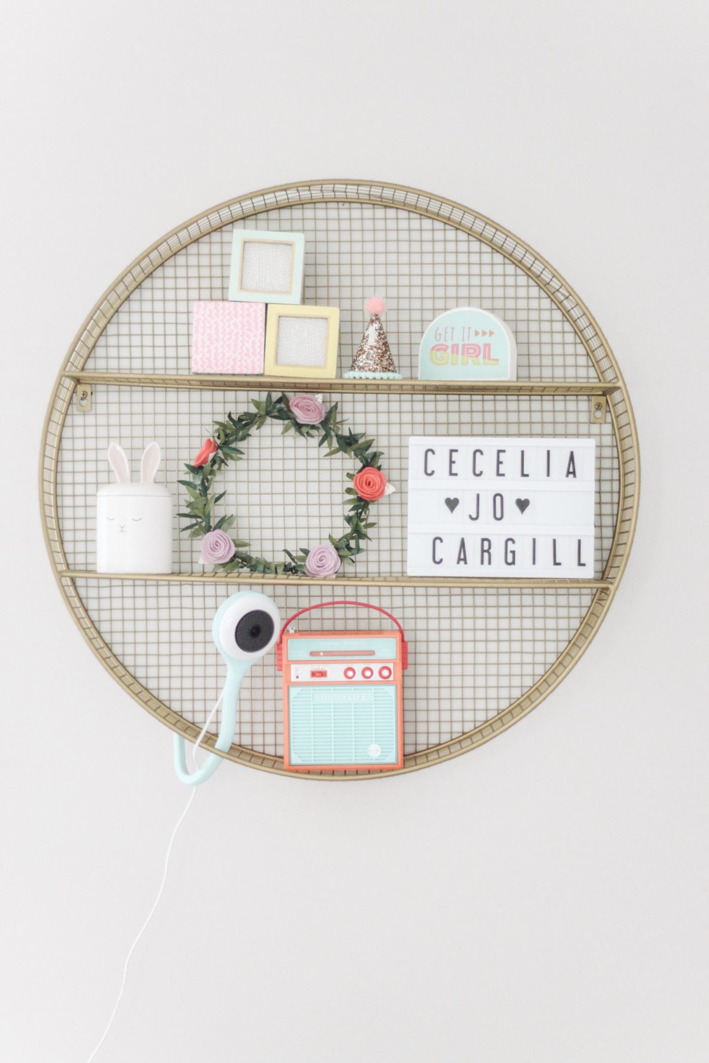
My favorite piece in her room:
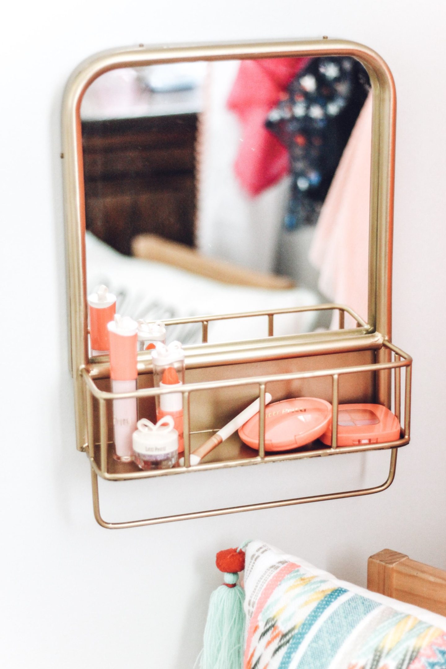
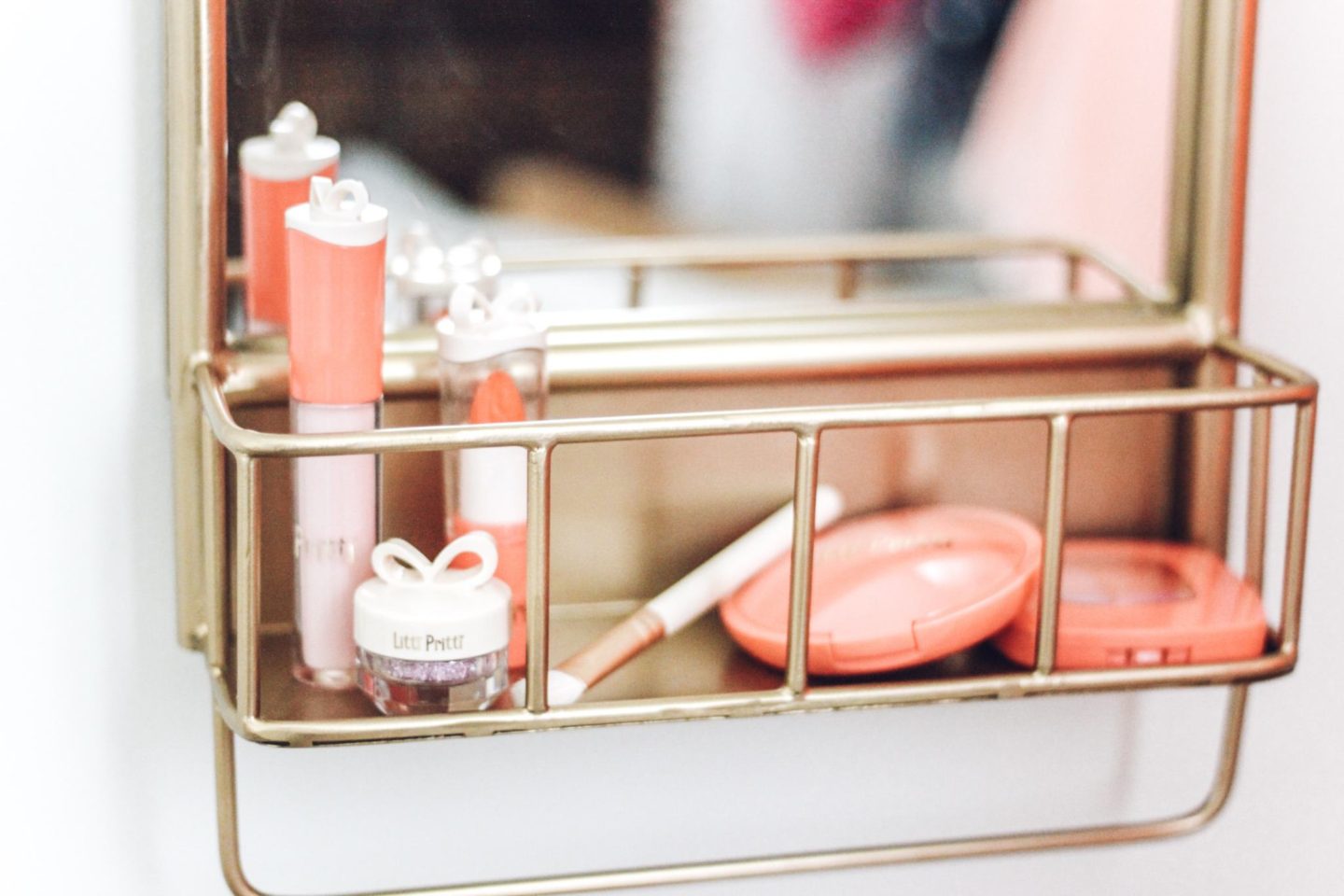
The gold shelf is such a statement piece in her room. It was exactly what I needed to display all of her cute little knick-knacks. It’s also perfect for storing things I need to keep out of reach. I put her hair ties on it so she can’t get into them like she likes to. This is definitely my favorite piece in her room and it really ties everything together.
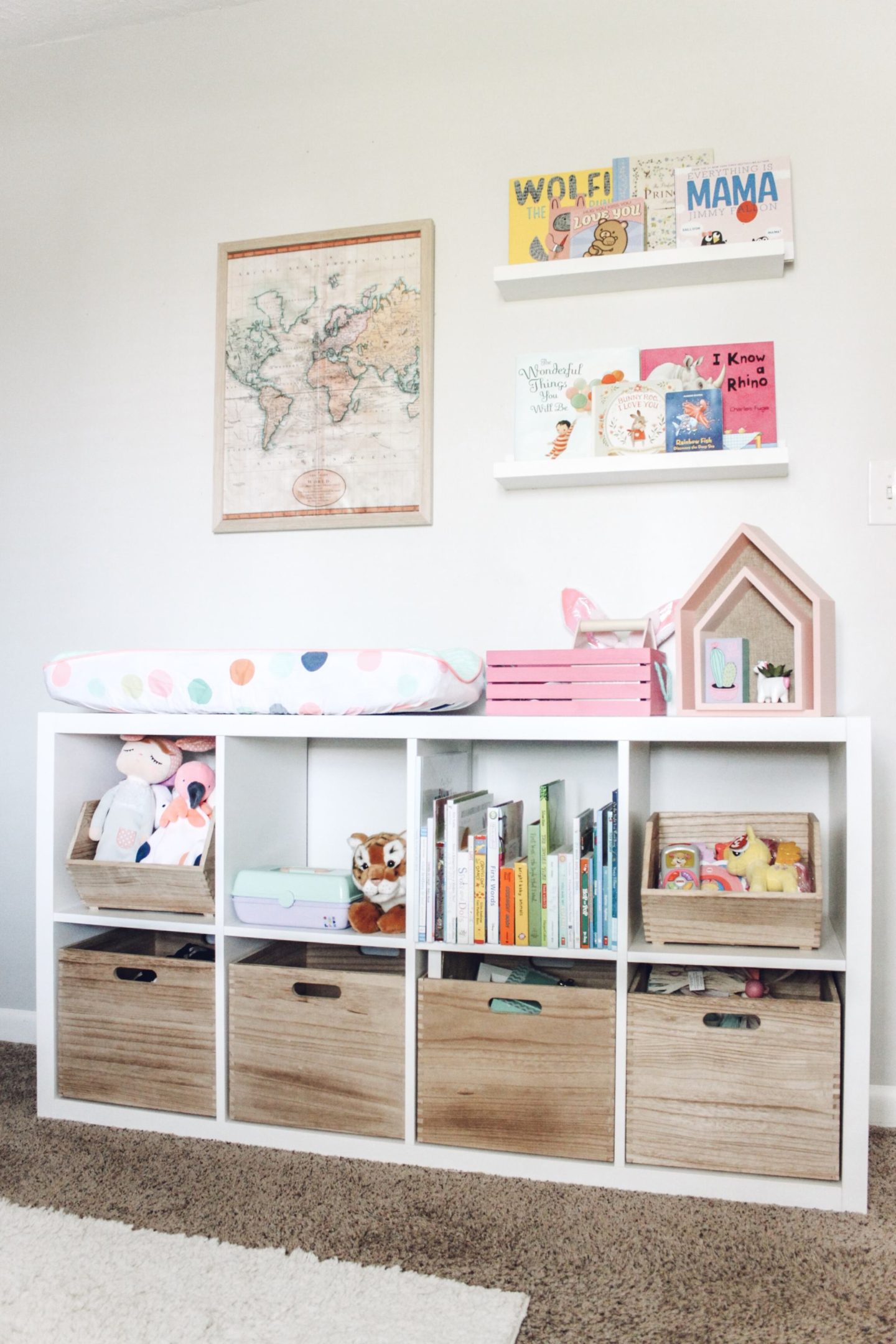
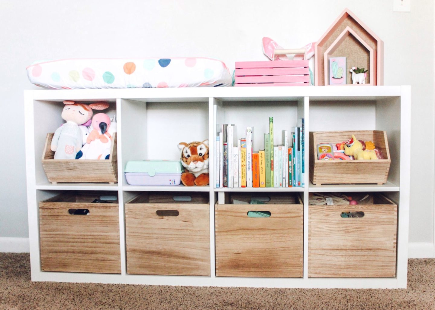
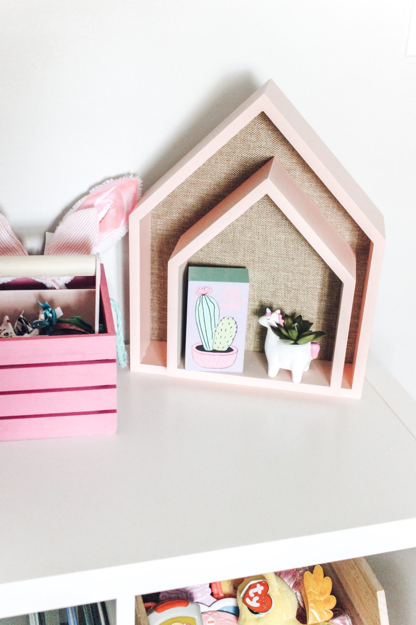
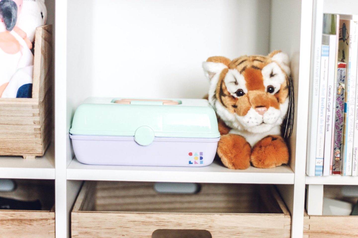
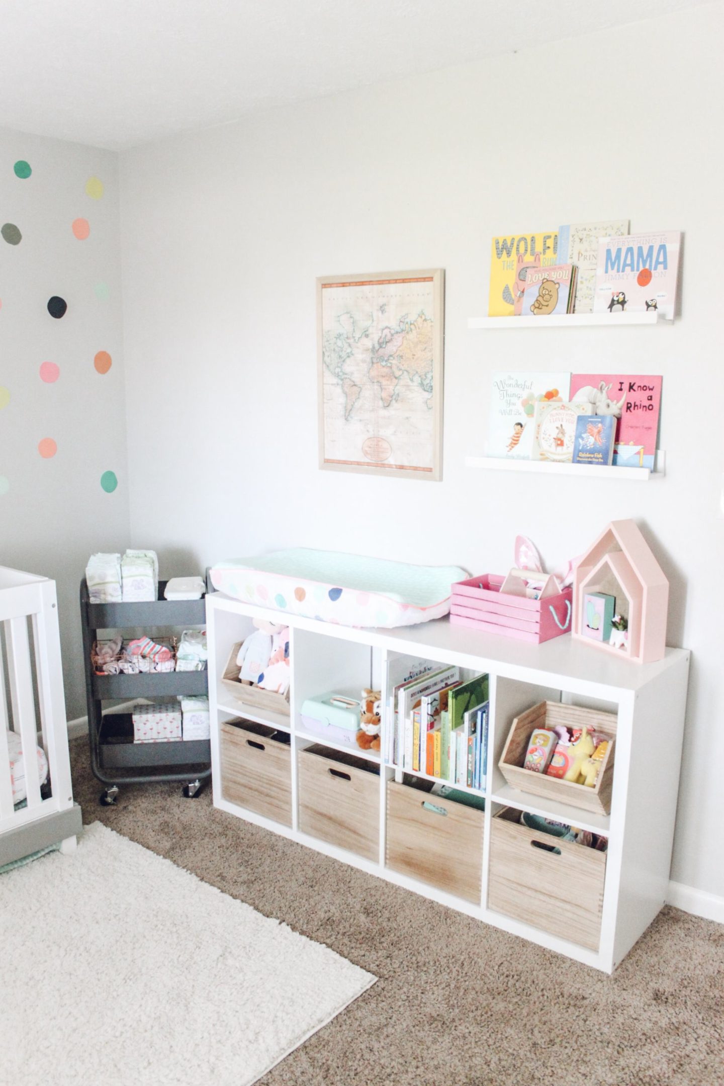
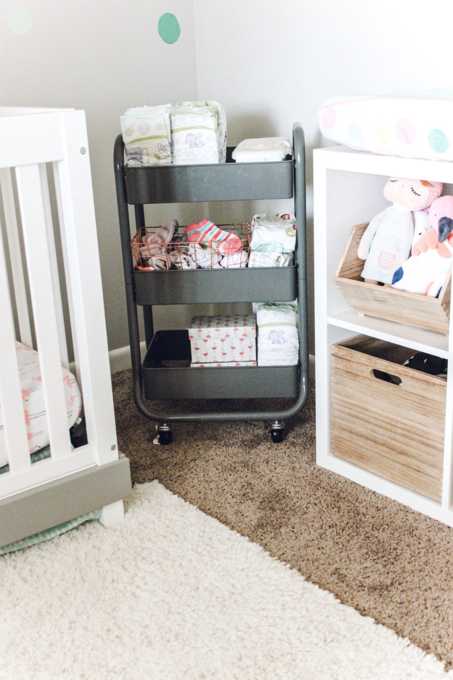
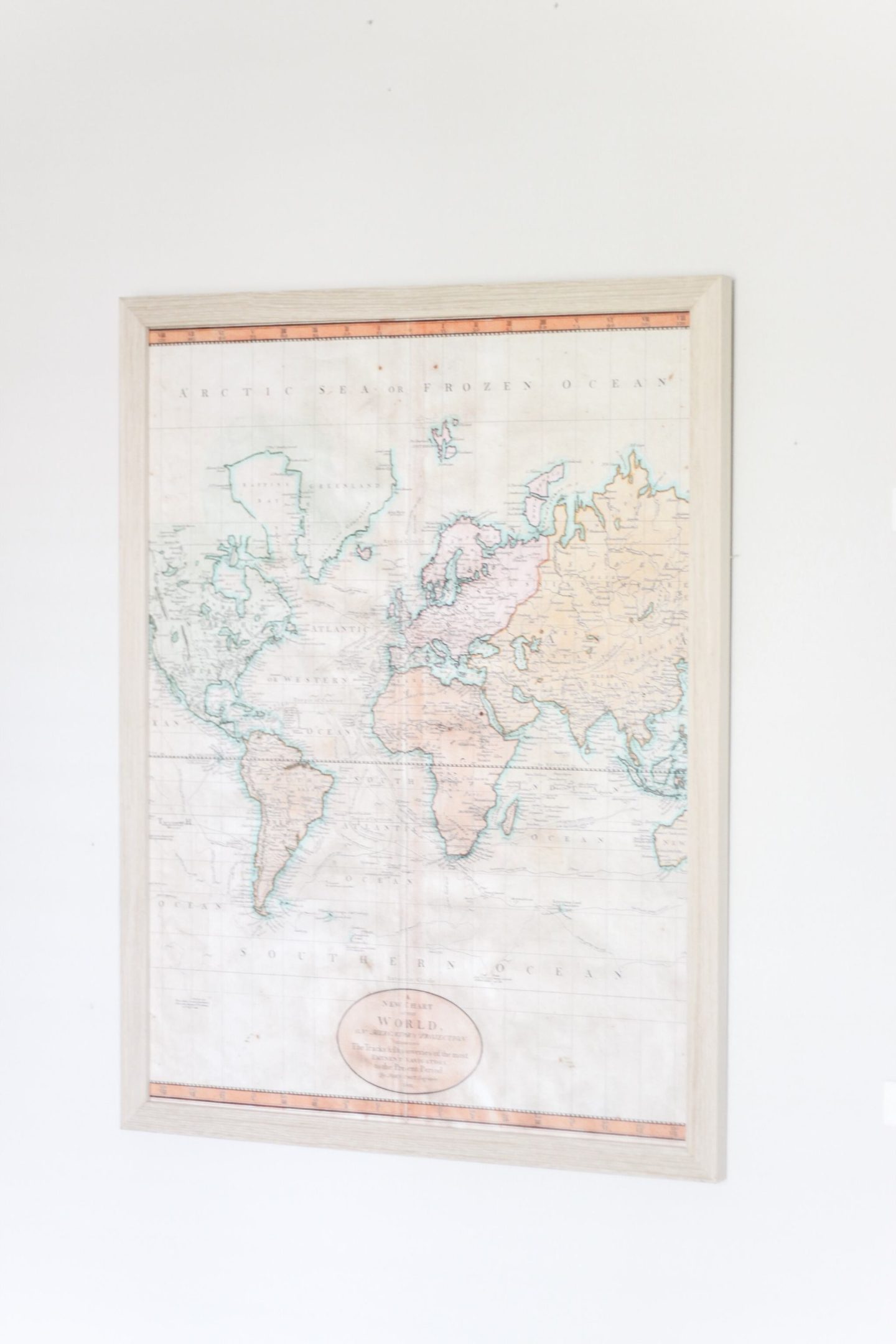
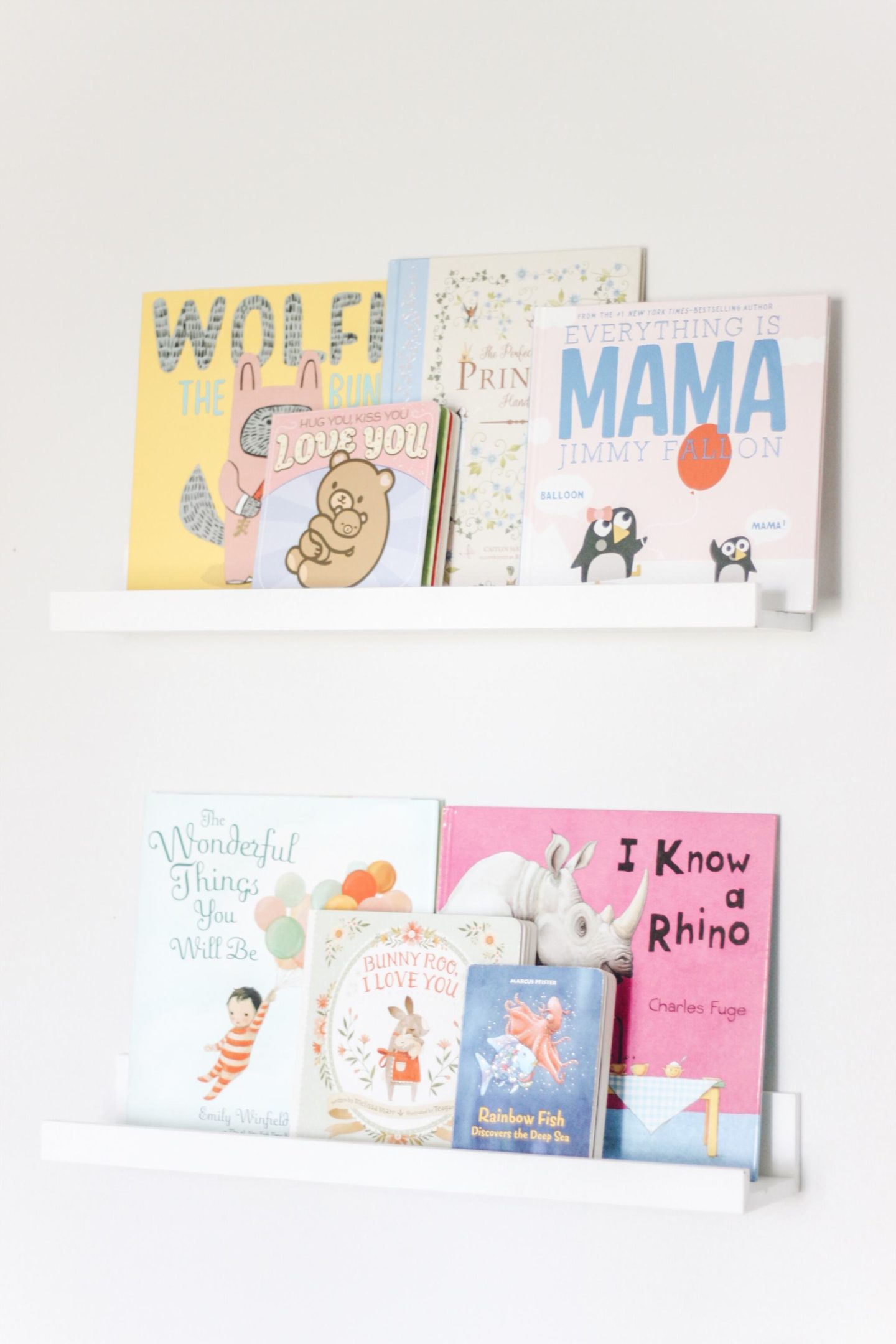
Above the Ikea shelf we added a map from Society 6. They have the cutest original artwork. I love the concept of their site because they pay the actual artists. The colors in this map went perfectly with her room. We moved her book shelves here. I love displaying books in my kids rooms. The IKEA cube shelf is a mixture of books, toys and clothing storage. It is super functional. I love the mixture of white and wood.
Check out Holly’s nursery here.
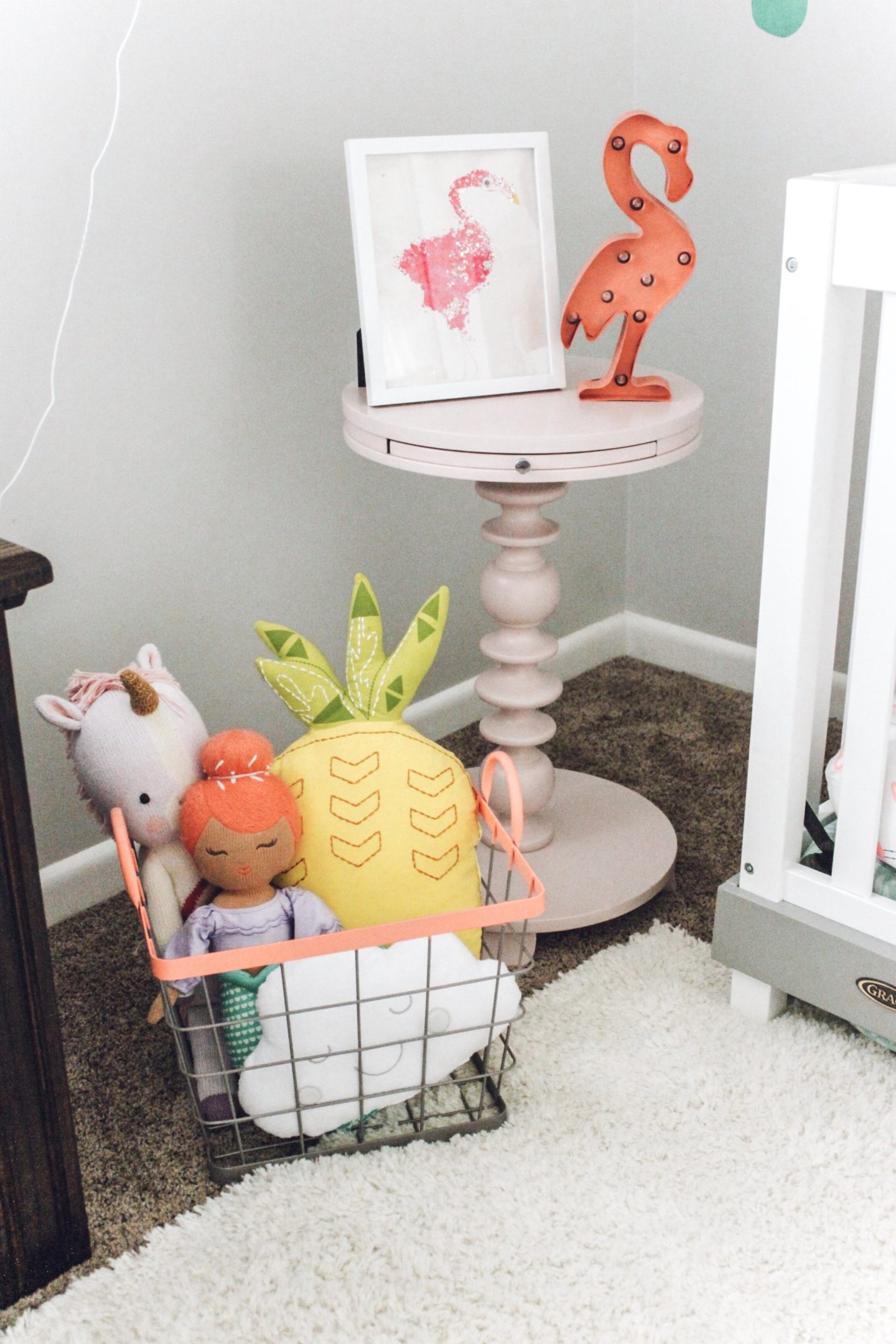
Looking for more inspiration? Check out my Nursery Inspiration Pinterest board here.
Overall, Cece’s room is so much more functional than before. I am so happy that we upgraded her space. I love this bright baby girl nursery. It can take time and a few tries to get a space right so if it isn’t exactly how you want it right away don’t give up. Sometimes you just have to play with a space and try it multiple ways before getting it just right.
